
Same Stats, Different Graphs: Generating Datasets with Varied Appearance and Identical Statistics through Simulated Annealing has some great figures I want to share.
They show datasets which are identical over a number of statistical properties, yet produce dissimilar graphs, are frequently used to illustrate the importance of graphical representations when exploring data.
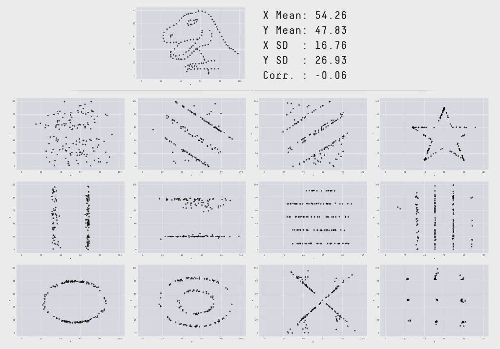


As a geo-scientists, I always like to have a detailed map of the terrain 😉
As mentioned on my home page :
“If the map doesn’t agree with the ground the map is wrong”
Gordon Livingston – Too Soon Old, Too Late Smart
In addition to the original post, I’d like to add 2 more reference:
Download the Datasaurus: Never trust summary statistics alone; always visualize your data
and from Scientific American:
What This Graph of a Dinosaur Can Teach Us about Doing Better Science
